Caltific
Calorie tracking without the homework. Snap a photo or scan a barcode, and get a full nutrition breakdown.
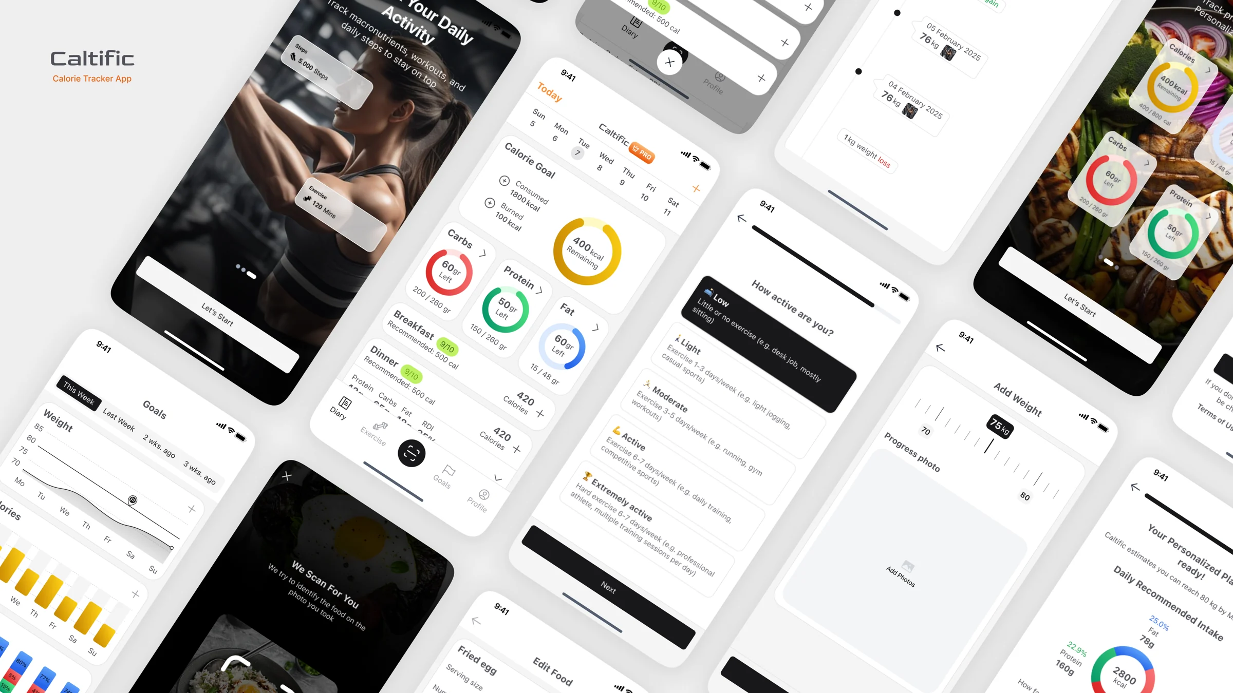
Calorie tracking feels like homework.
Most people give up on calorie tracking within weeks. Logging every meal by hand is slow, and guessing portion sizes makes the numbers feel unreliable.
The goal was an app that removes that effort with AI, and a landing page that makes the value clear in a few seconds and moves visitors to download.
Value above the fold
Snap a photo, get your calories, understood instantly.
Fast meal logging
From camera to diary in as few steps as possible.
Drive downloads
App Store and Google Play always one step away.
Every screen size
Desktop, tablet and mobile at the same quality.
Four ways AI takes the effort out.
AI-Powered Food Recognition
Identifies thousands of foods from a single photo for quick, accurate logging.
Voice & Barcode Input
Say what you ate, or scan a barcode to log packaged food instantly.
Personalized Meal Plans
Suggestions tailored to dietary preferences and health goals.
Smart Portion Estimation
Estimates portion sizes even when you don't know the exact weight.
Mapping the app before styling it.
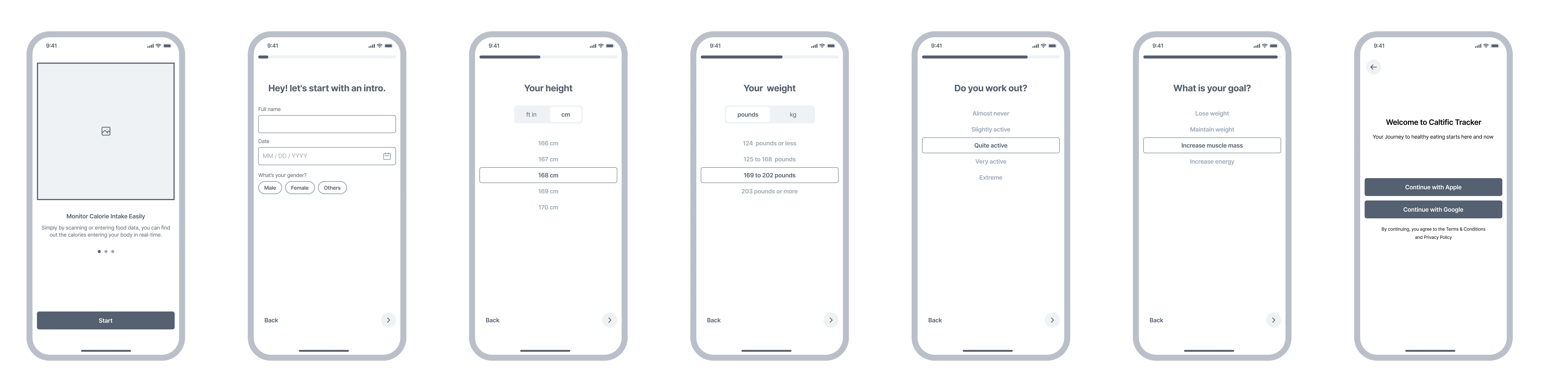
Before any visual design, I mapped the core journeys as low-fidelity wireframes: setting up a new user, converting them to a subscription, and the two ways to log a meal. Working in grayscale kept the focus on flow and hierarchy.
Onboarding
Collects the basics for a personal calorie target, one question per screen.
- Welcome
- Intro
- Height
- Weight
- Workout
- Goals
- Sign up
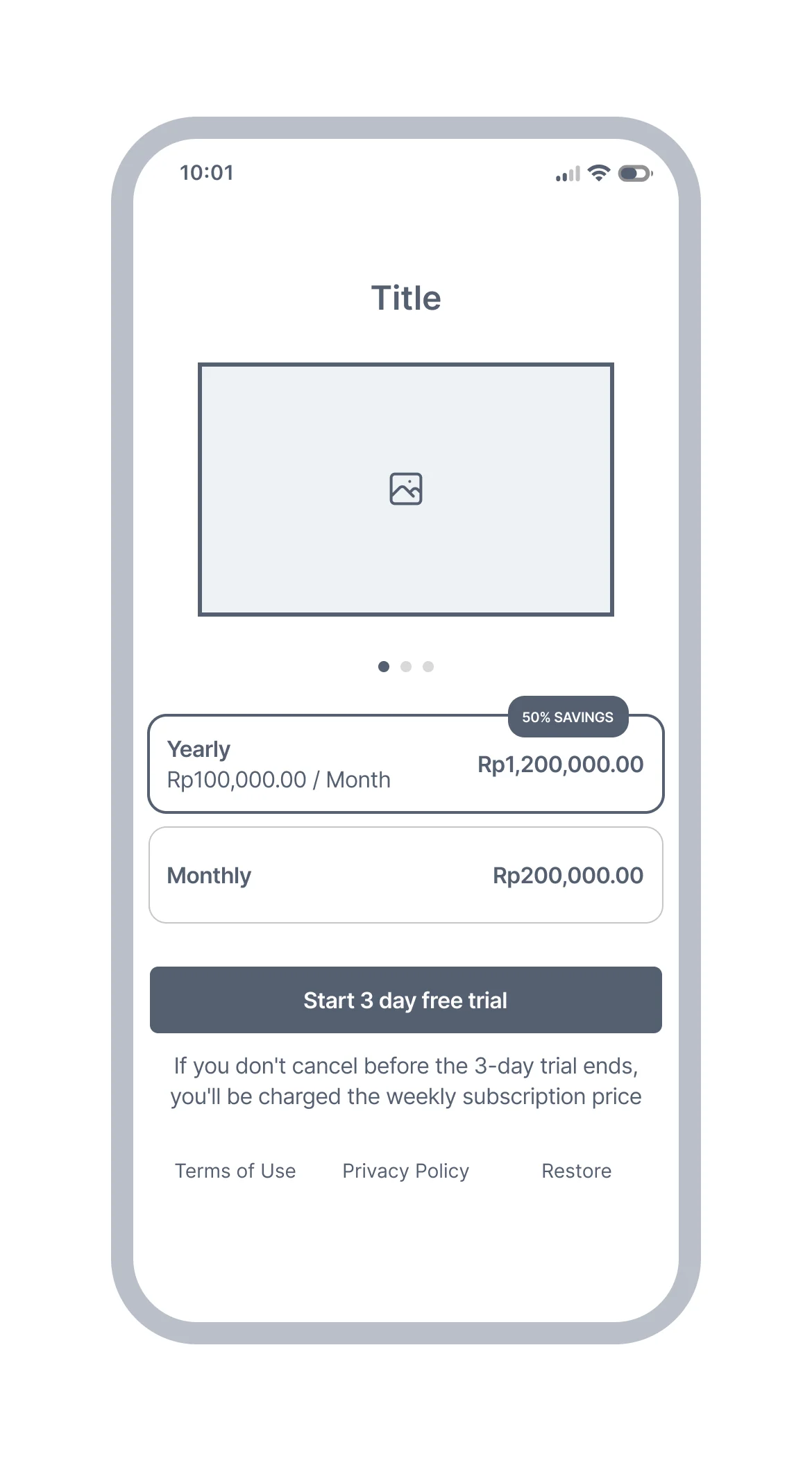
Paywall
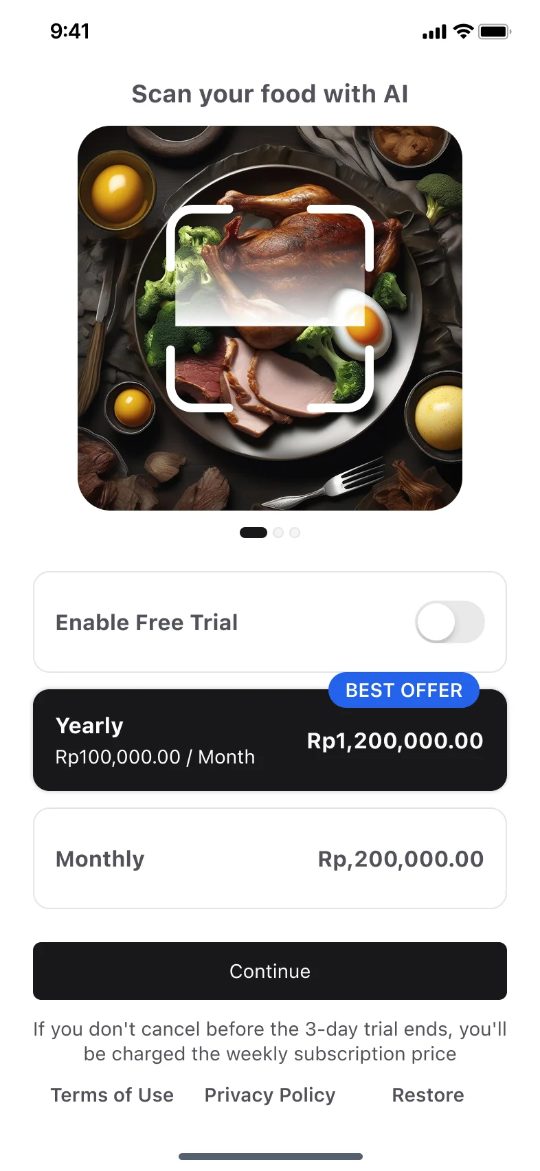
Yearly and monthly plans, a free-trial CTA and clear trial terms.
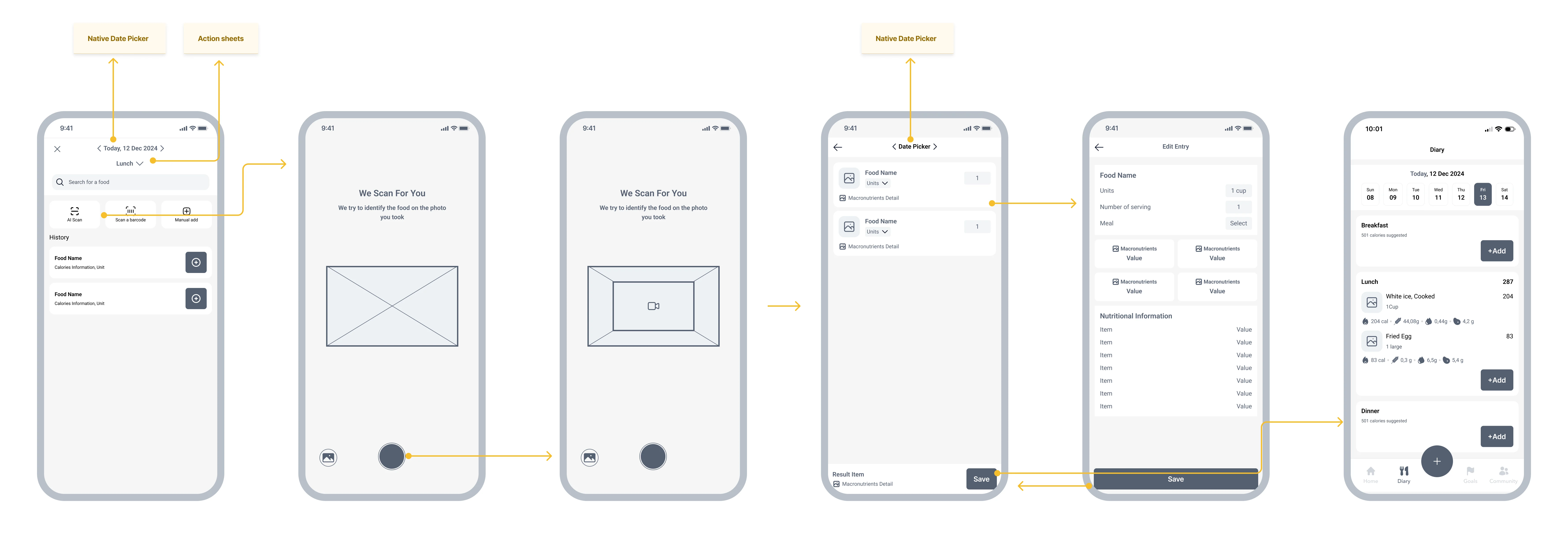
AI Scan
The core feature: photograph a meal, let AI identify it, review and save to the diary.
- Add food
- Capture
- Analyze
- Add meal
- Edit entry
- Diary
Scan a Barcode
For packaged food: scan it, or type the code when the camera can't read it.
- Add food
- Capture
- Add meal
- Diary
- Edit entry
- Input barcode
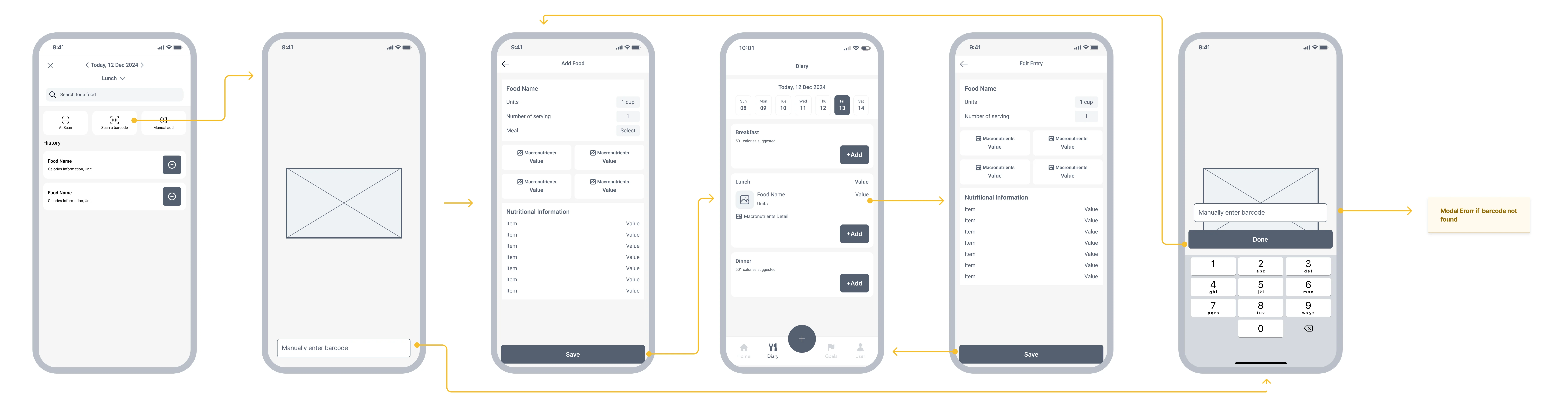
Explaining the flow.
The landing page follows a classic product-page structure: a two-column hero, a 2×2 feature grid, and a three-step "How it works" section with lifestyle phone mockups, ending in a download CTA.
Each block answers one question (what the app does, why it helps, how it works) so visitors can decide to download without leaving the page.
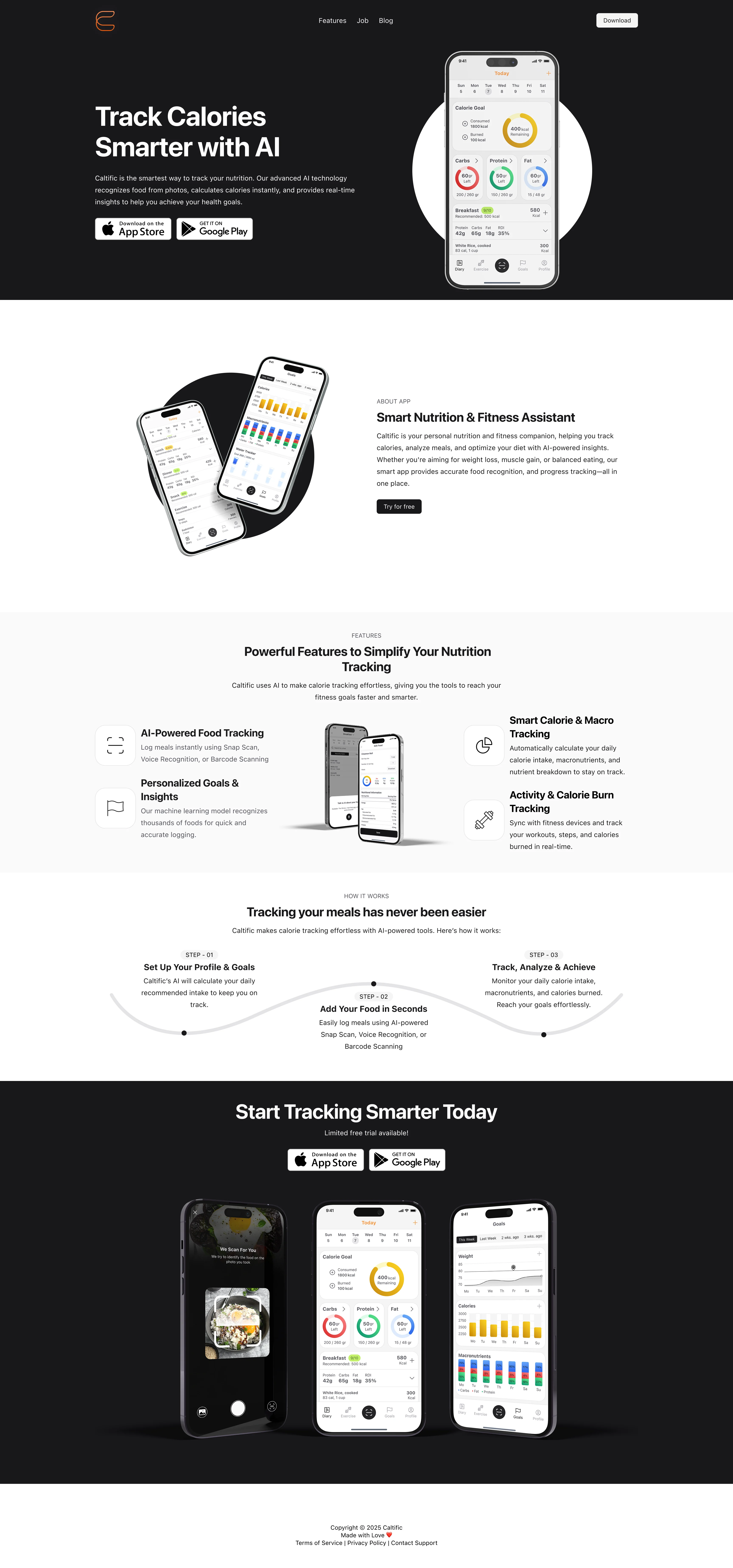
One page, three breakpoints.
The page was designed for desktop (1728px), tablet (744px) and mobile (393px).
- Navigation collapses into a hamburger menu with a full-width download button.
- Feature cards reflow from a multi-column layout into a single column.
- Store badges stack vertically on small screens to stay easy to tap.


A quiet system, so the data stands out.
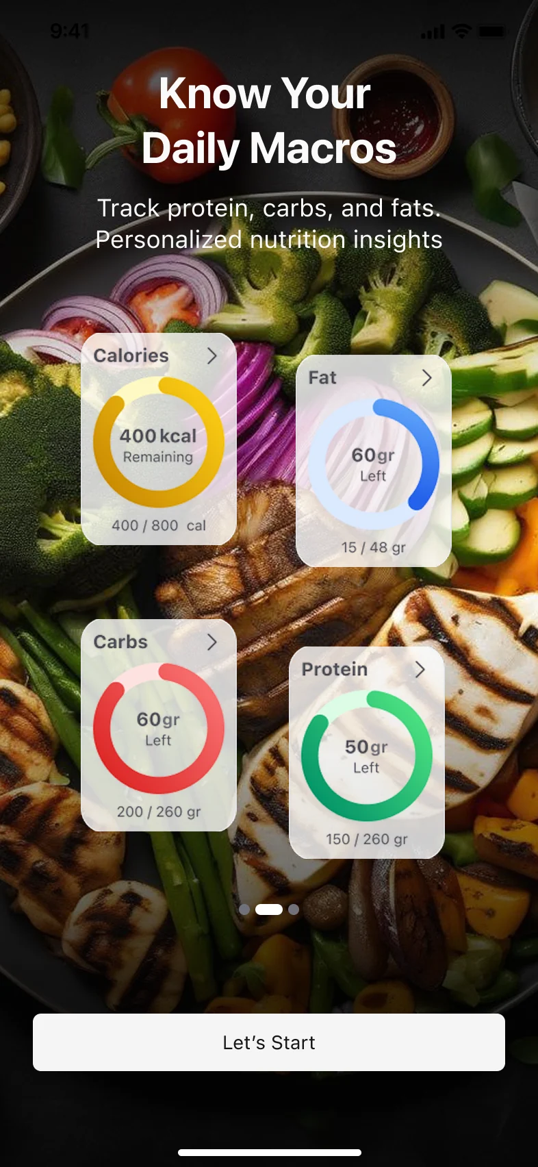
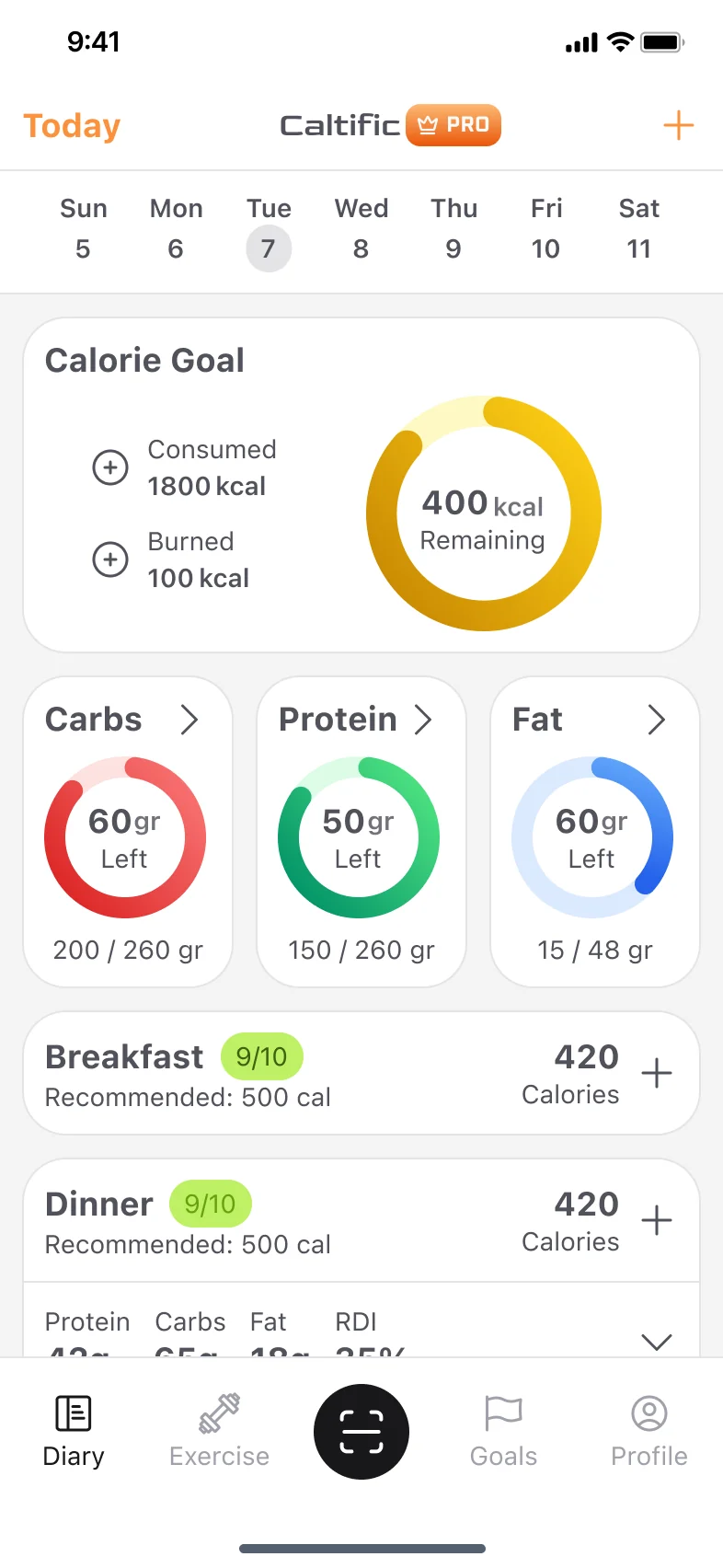
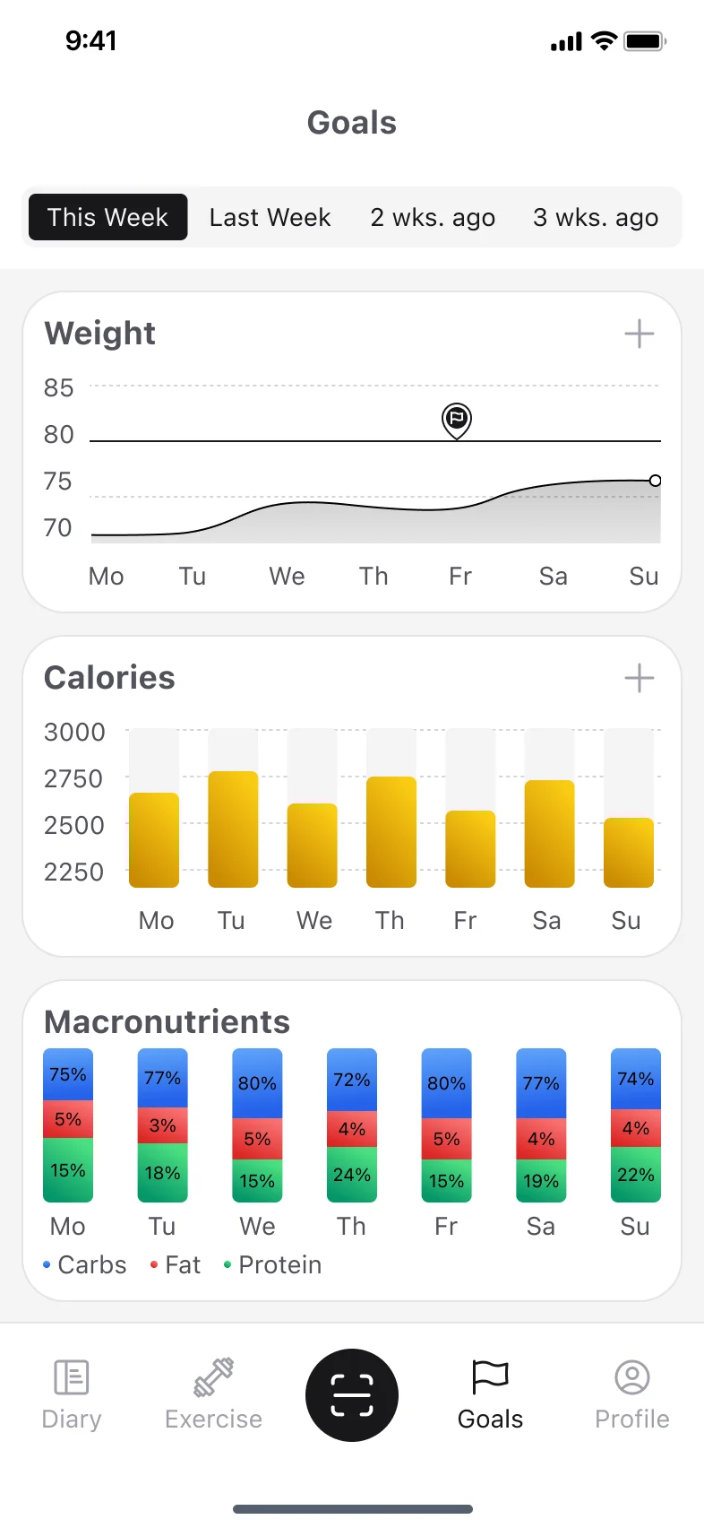
One typeface, a neutral colour scale and a single orange accent keep the interface calm. Colour is saved for the nutrition data: yellow for calories, red for carbs, green for protein and blue for fat.
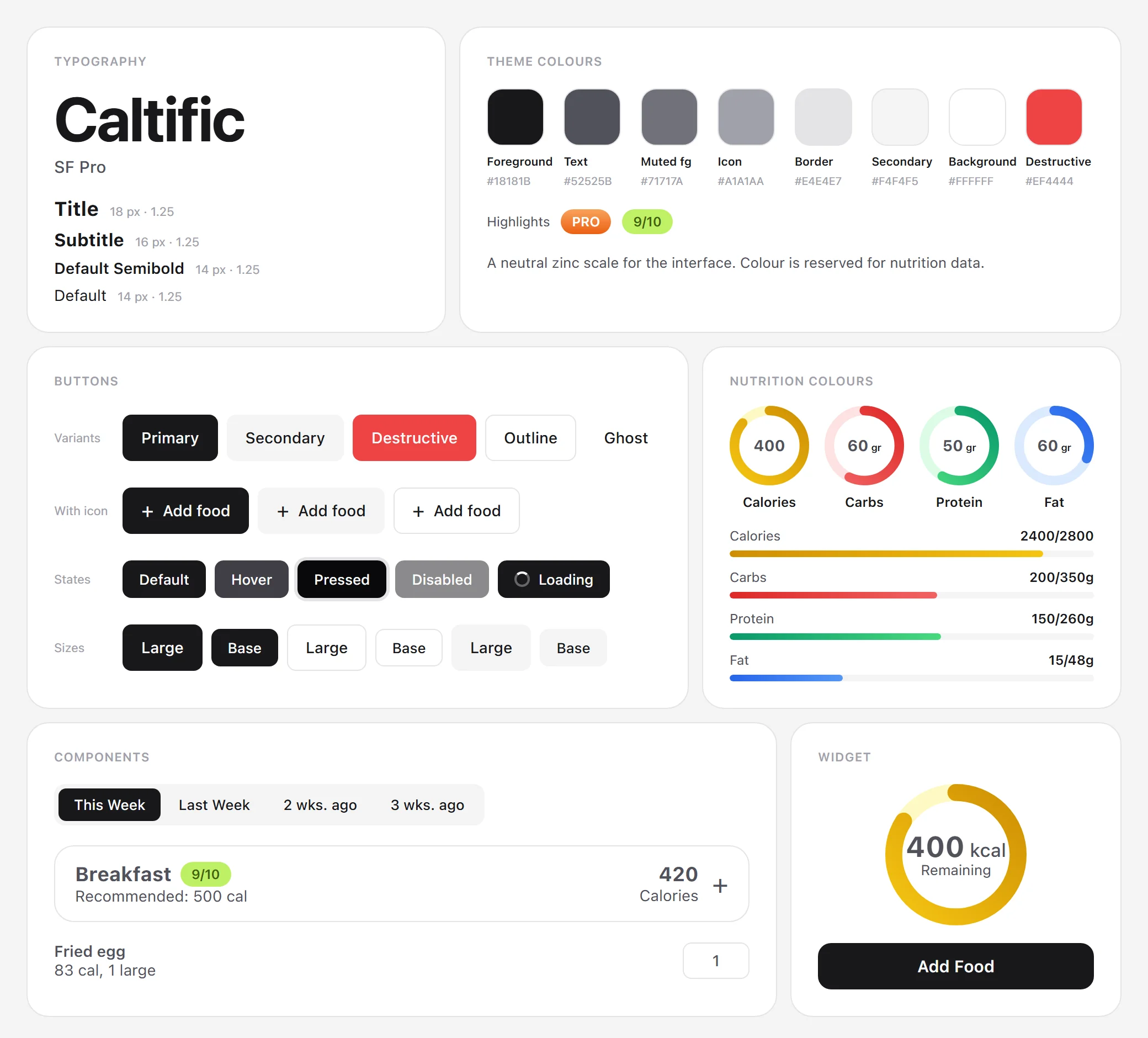
From wireframe to finished app.
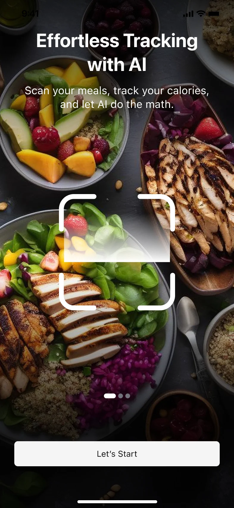
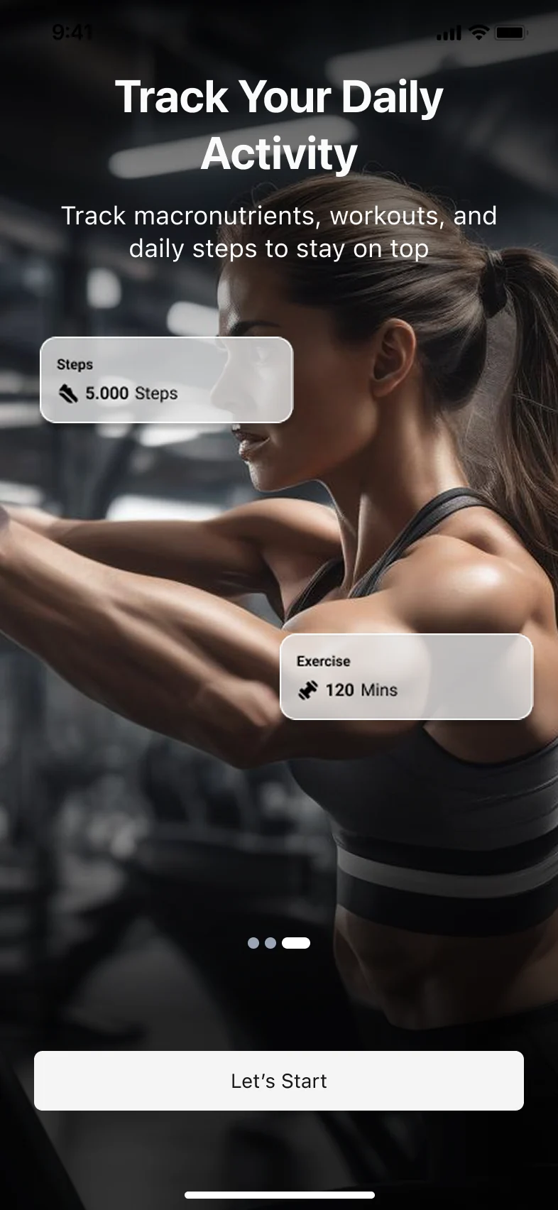
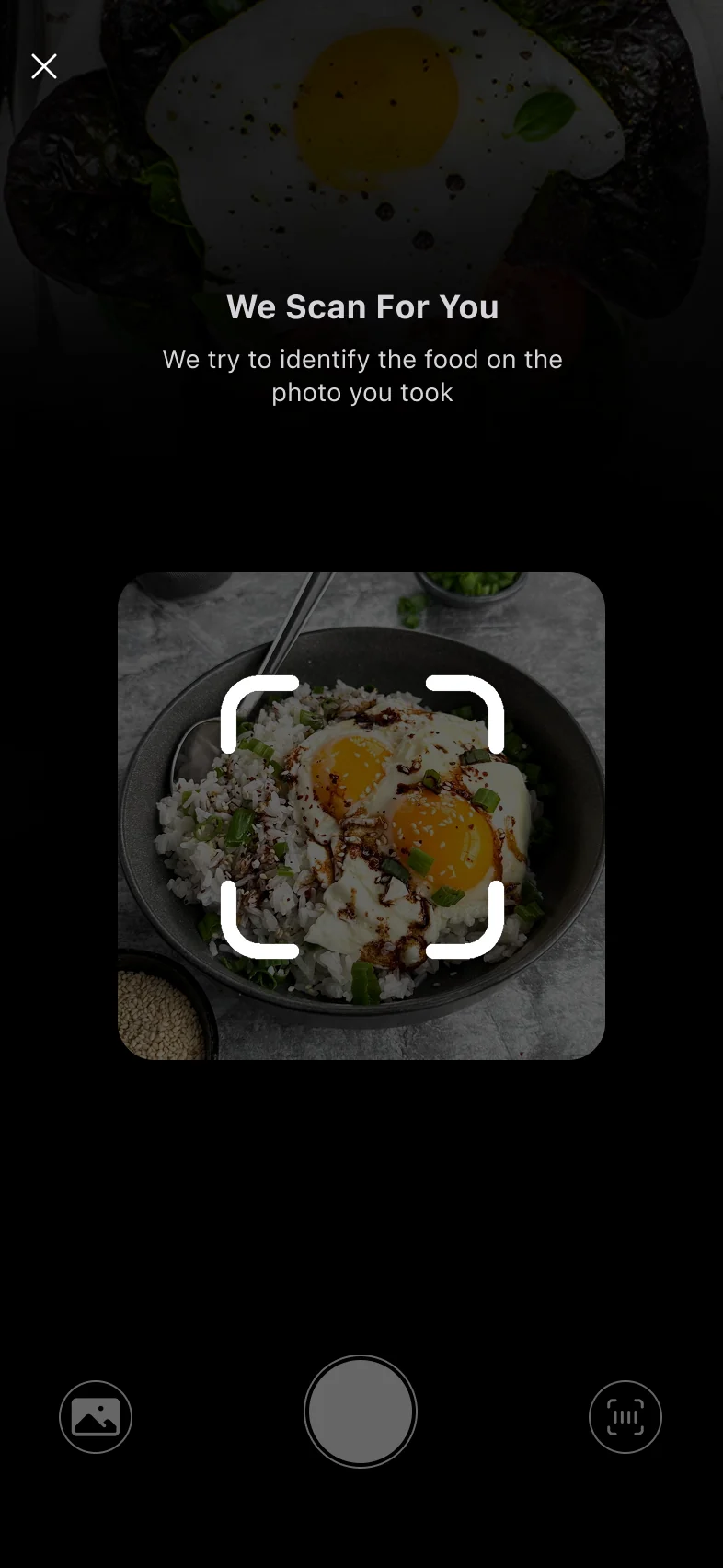
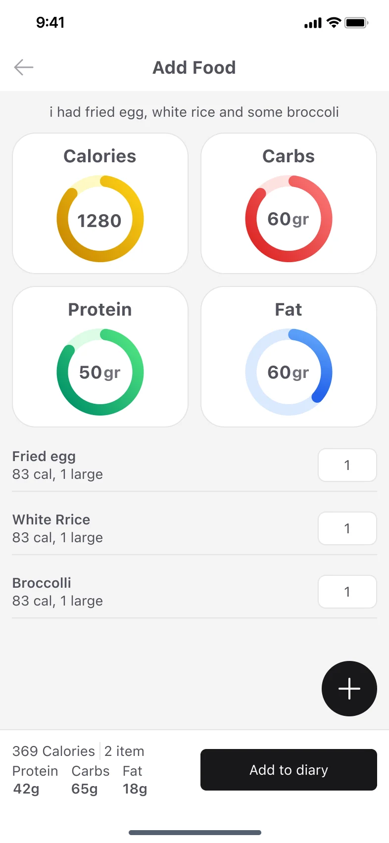
The final screens follow the flows mapped in the wireframes: onboarding and the paywall, then the AI Scan flow: start from the diary, photograph the meal, review what the AI found and add it to the day.
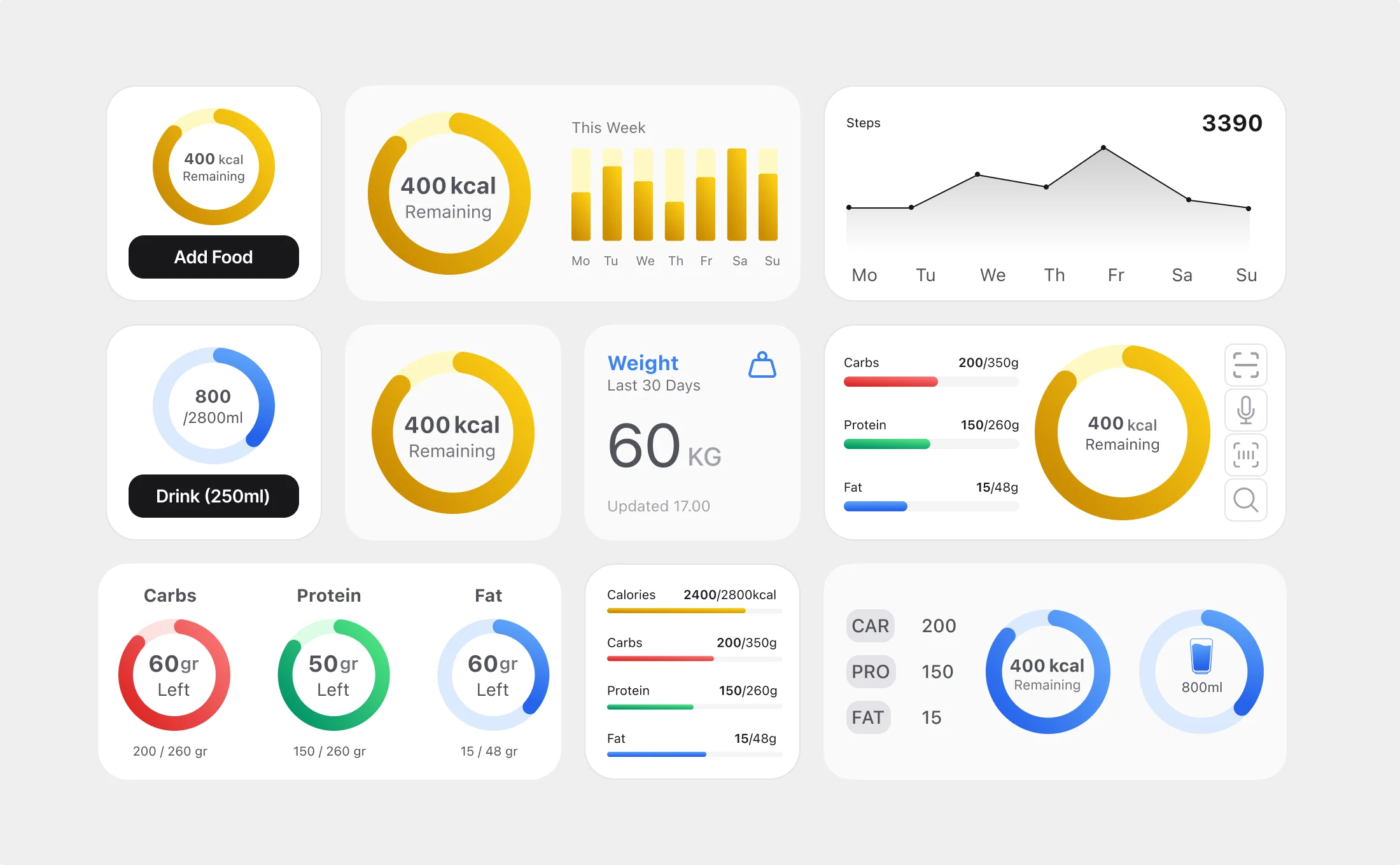
Home screen widgets
The numbers people check most (calories left, macros, water, weight and steps) without opening the app.
Mapping every flow in grayscale first made the visual design faster, because the hard decisions about steps and hierarchy were already made.
Next, I would test the AI Scan flow with real users to see where they hesitate between taking the photo and saving the meal.