Cook It Real Good
A recipe website for quick, easy and family-friendly meals, designed to put the food first.
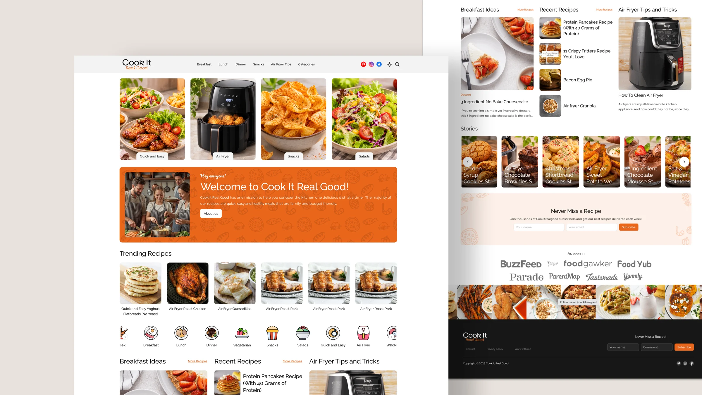
Help people find tonight's dinner fast.
Cook It Real Good shares quick, easy and healthy recipes that are family and budget friendly. Visitors usually arrive hungry and short on time, so the site has to get them to a recipe in as few steps as possible.
I designed the homepage, the category pages, the article listing and the author page for desktop and mobile, with a warm look that lets the food photography do the selling.
Food first
Large photos, short labels and very little chrome around them.
Browse by meal
Breakfast, lunch, dinner and snacks are one click from any page.
Reasons to return
Trending and recent recipes, stories and a newsletter signup.
One template system
Every listing page reuses the same header, grid and footer.
A menu, not a magazine.
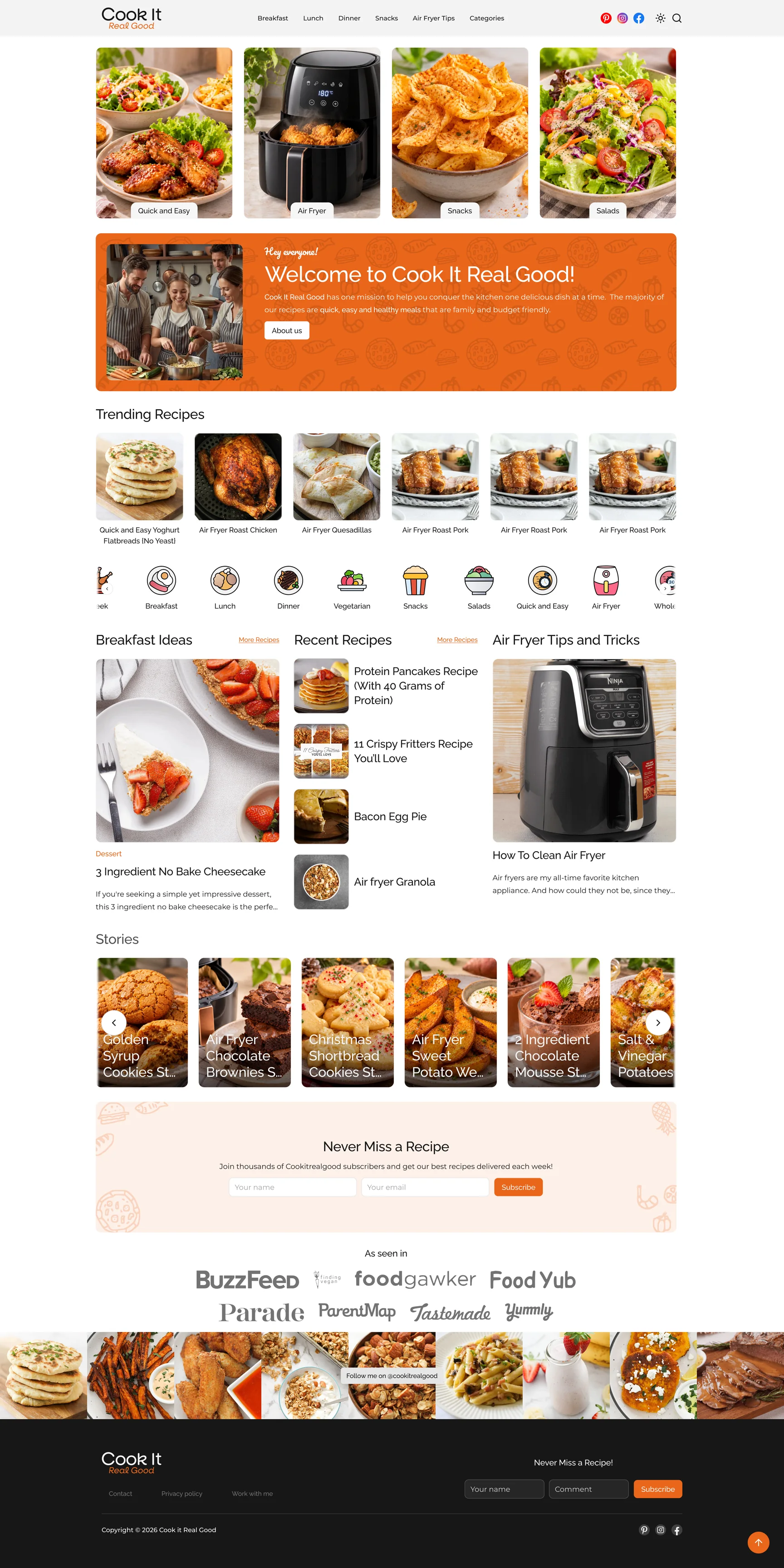
The homepage opens with four category tiles instead of a hero slider, so the first thing a visitor does is choose what kind of meal they want. A short welcome banner explains the site in two sentences, then the page moves straight into recipes.
- Trending recipes sit in one row of six, with an icon rail of every category underneath.
- Three columns pair Breakfast Ideas, Recent Recipes and Air Fryer Tips so the page has more than one way in.
- Stories, the newsletter signup and the press logos close the page before the Instagram strip and footer.
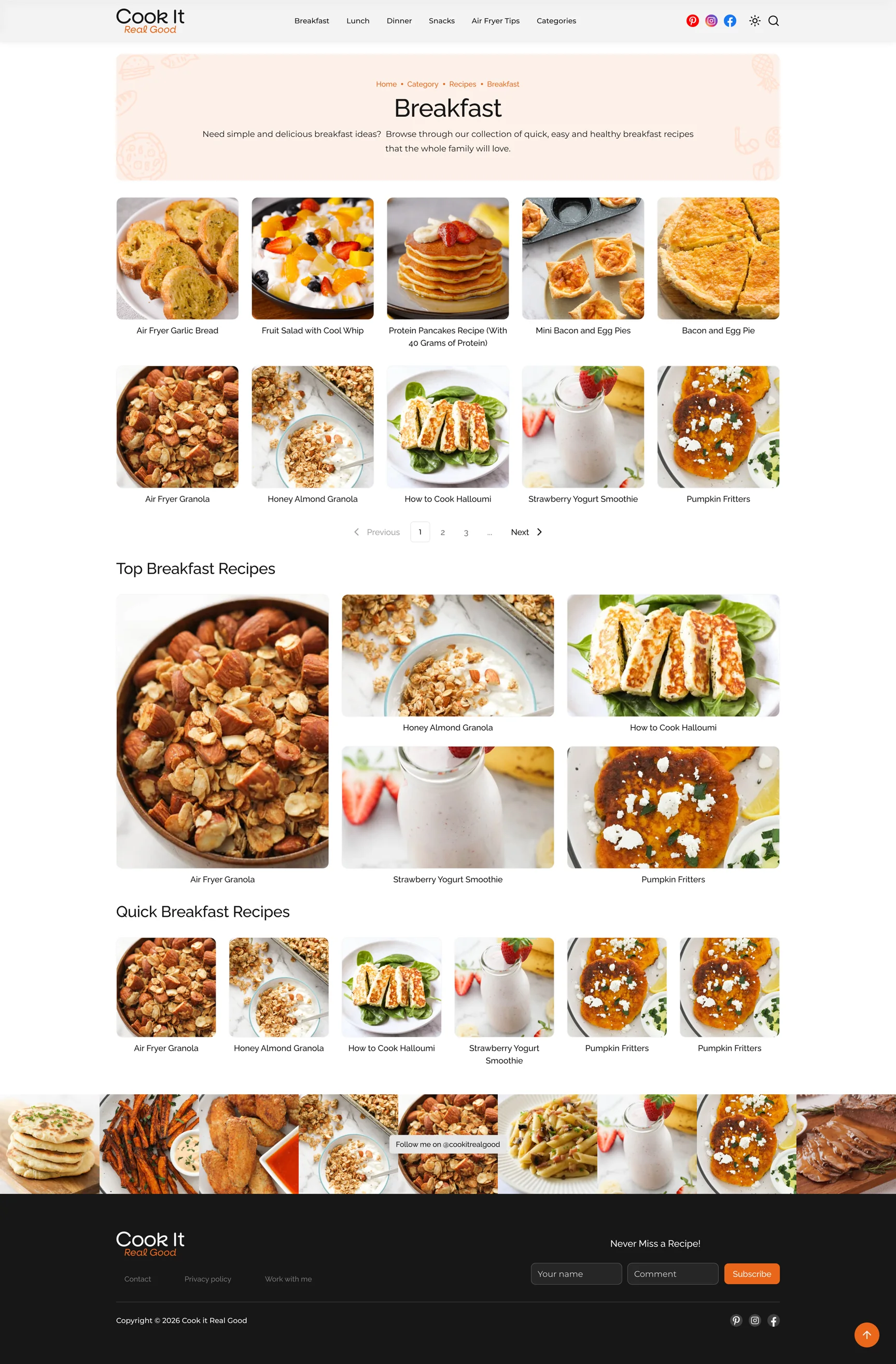
One layout for every meal.
Breakfast, Lunch, Dinner and Snacks share a single template: a soft peach header with a breadcrumb and a one-line intro, a paginated recipe grid, then two curated rows for the top and the quickest recipes in that category.
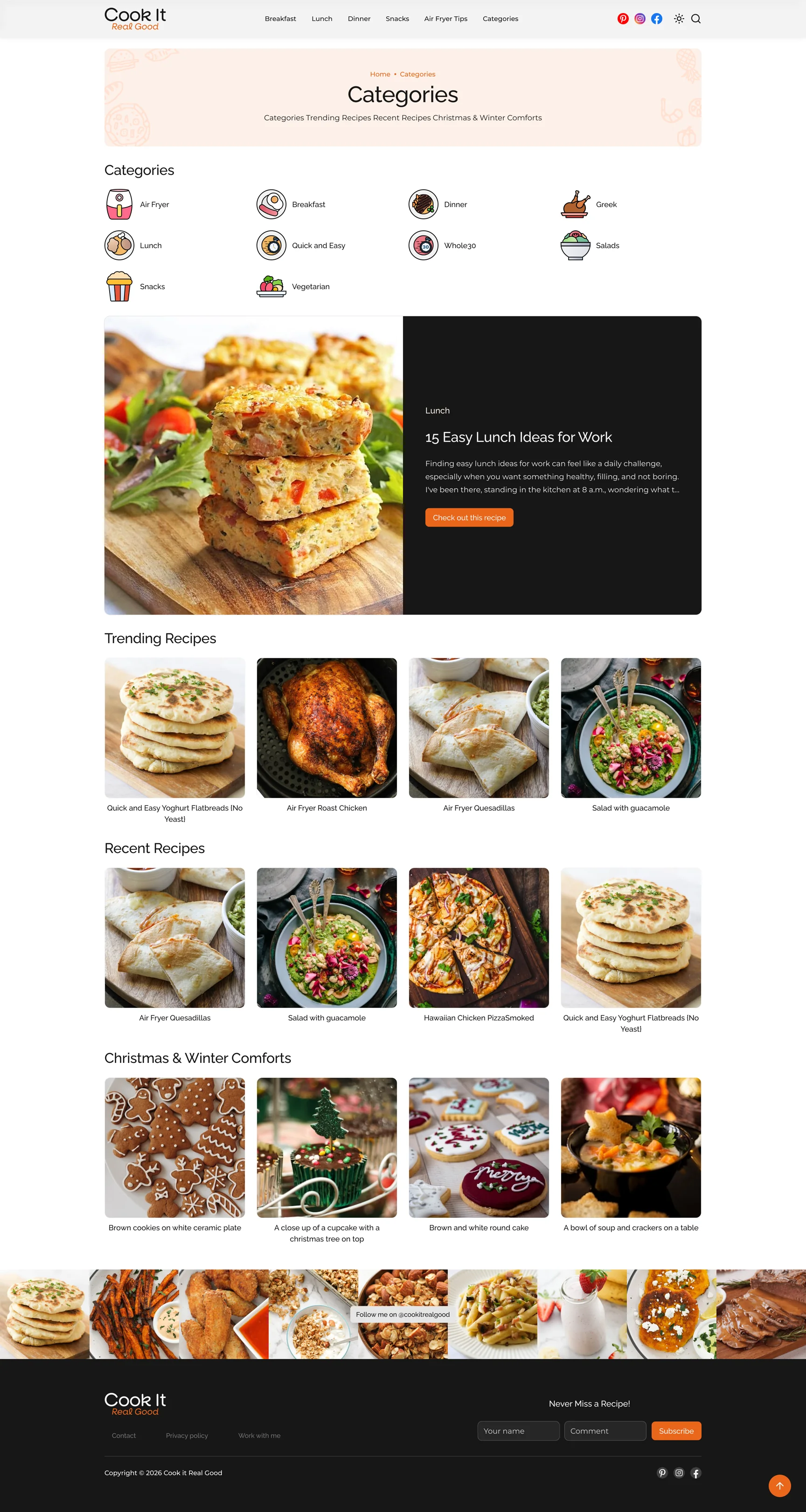
The Categories page works as the index. It lists every category with its own icon, features one collection in a dark highlight card, and repeats the trending, recent and seasonal rows.
Room for tips and for the person behind them.
Air Fryer Tips collects guides and buying advice in the same card grid as the recipes, so articles never feel like a separate site. The author page introduces Cassie with a photo, a short bio and her social links, followed by everything she has published.
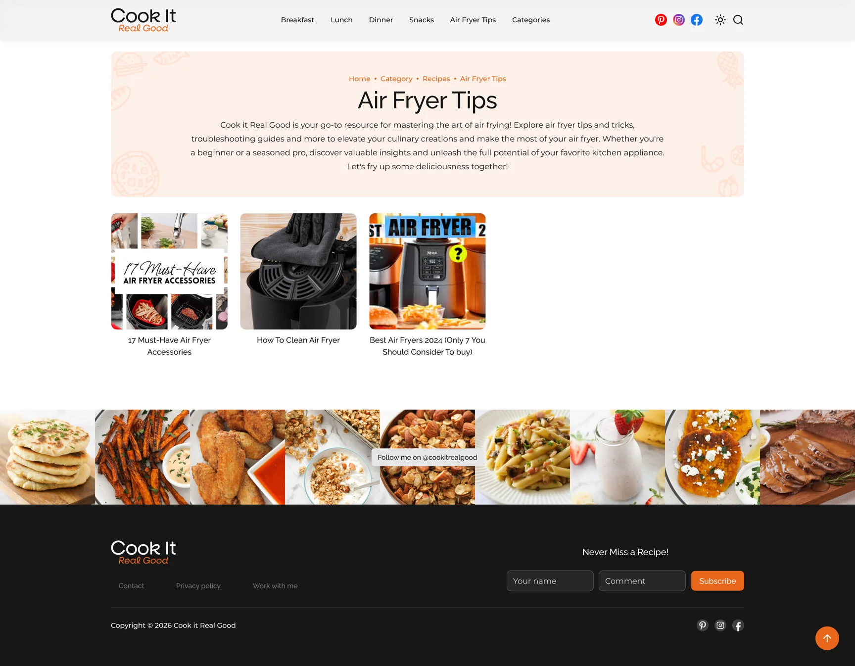
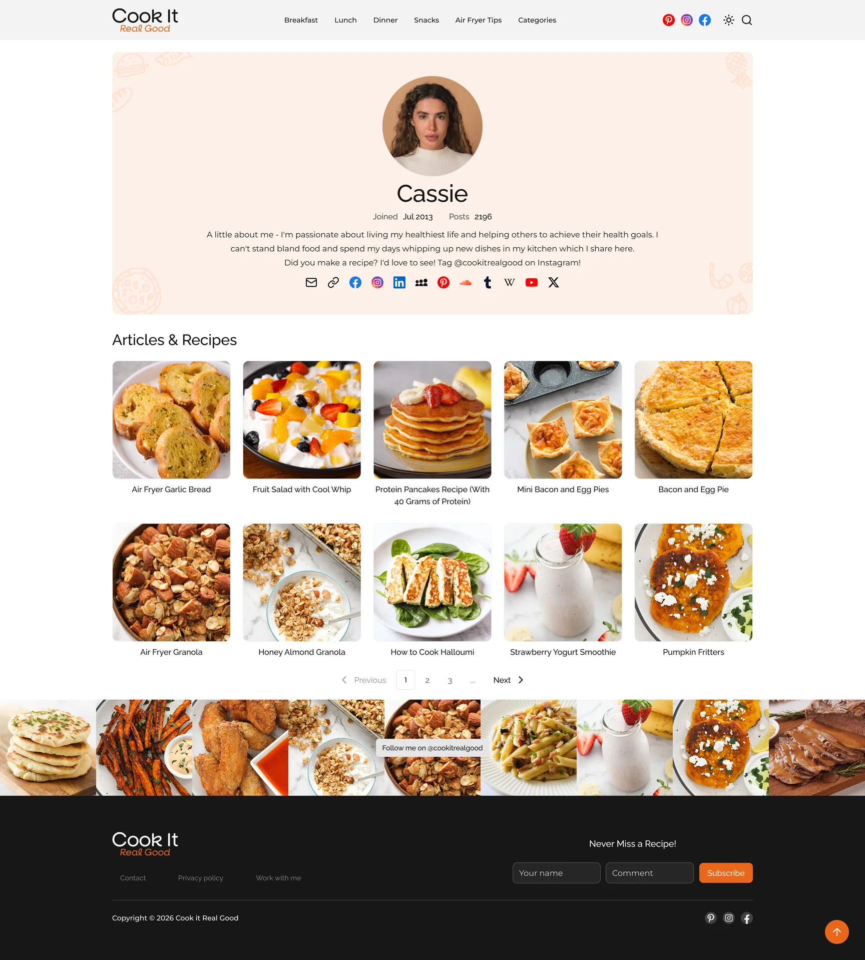
The same warm look on a small screen.
Every page was designed for mobile as well. Recipe grids drop to two columns, the navigation folds into a menu, and the peach headers and orange accents carry over unchanged.



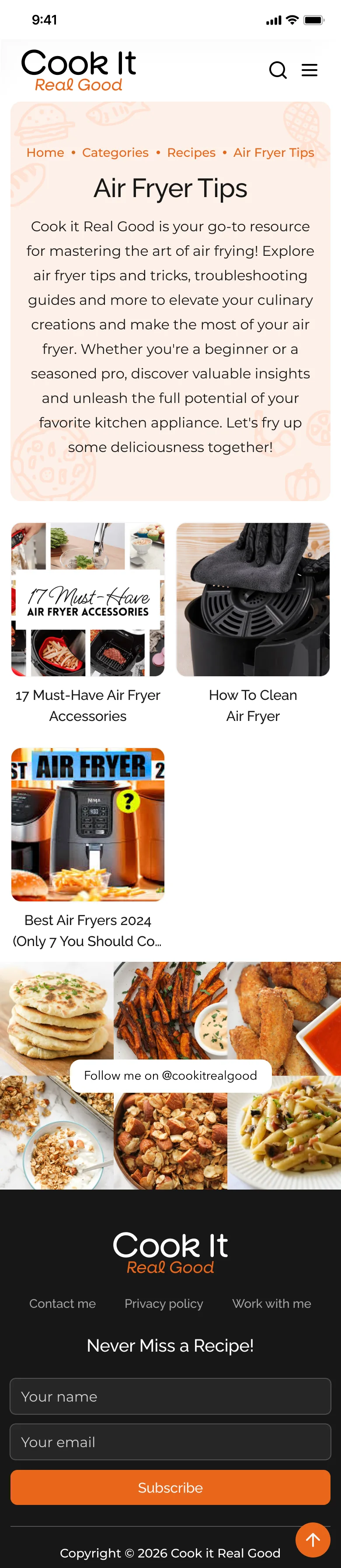
On a recipe site the photos are the interface. The less the layout competes with them, the faster people find something to cook.
Building every listing page from one template kept the design consistent and would make new categories cheap to add later.