Noid Coffee
A landing page for a coffee shop built around one idea: good coffee in a place where you can simply be yourself.
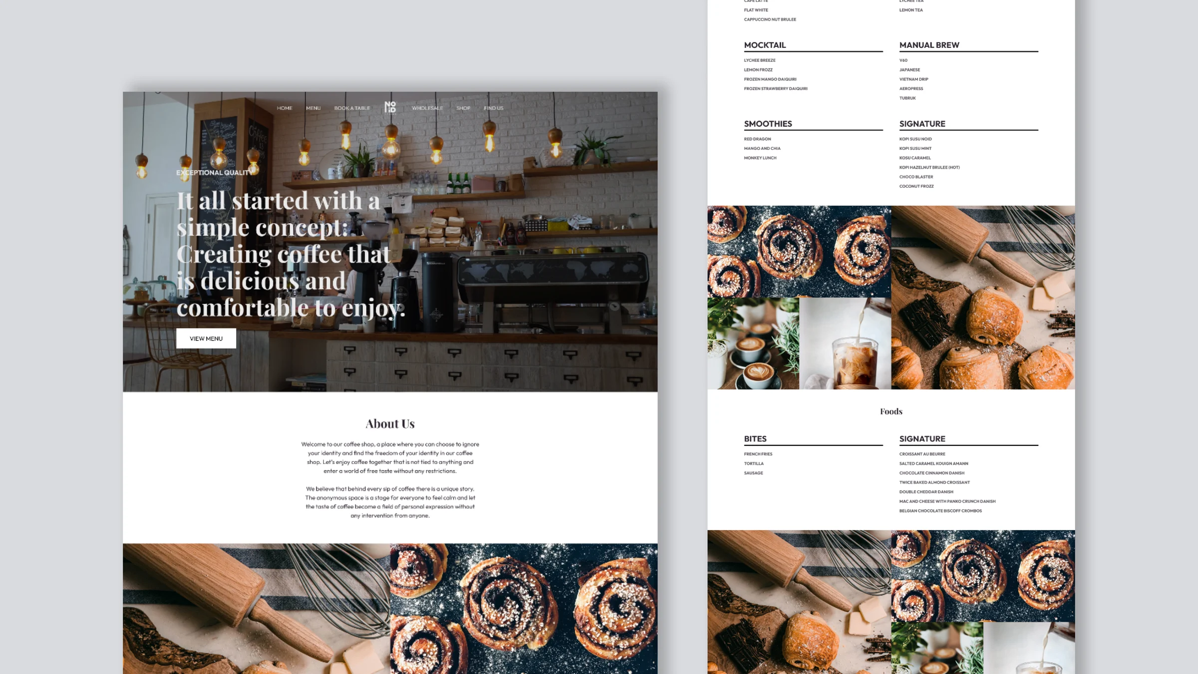
One page that feels like walking in.
Noid Coffee describes itself as an anonymous space, a shop where nobody asks who you are and the coffee does the talking. The landing page had to carry that calm, unhurried mood while still answering the practical questions: what do you serve, and what is this place about?
I designed a single long page that moves from atmosphere to menu to story, so a first-time visitor can decide to come in without clicking anywhere else.
Set the mood first
A full-width photo of the bar and one clear headline.
Menu at a glance
Every drink and dish readable without opening a PDF.
Tell the story
Philosophy, story and mission in short, quiet blocks.
Let photos breathe
Wide image bands break up the text between sections.
From atmosphere to menu to story.
The page is built as six stops in a fixed order. Each one answers a single question before handing over to the next.
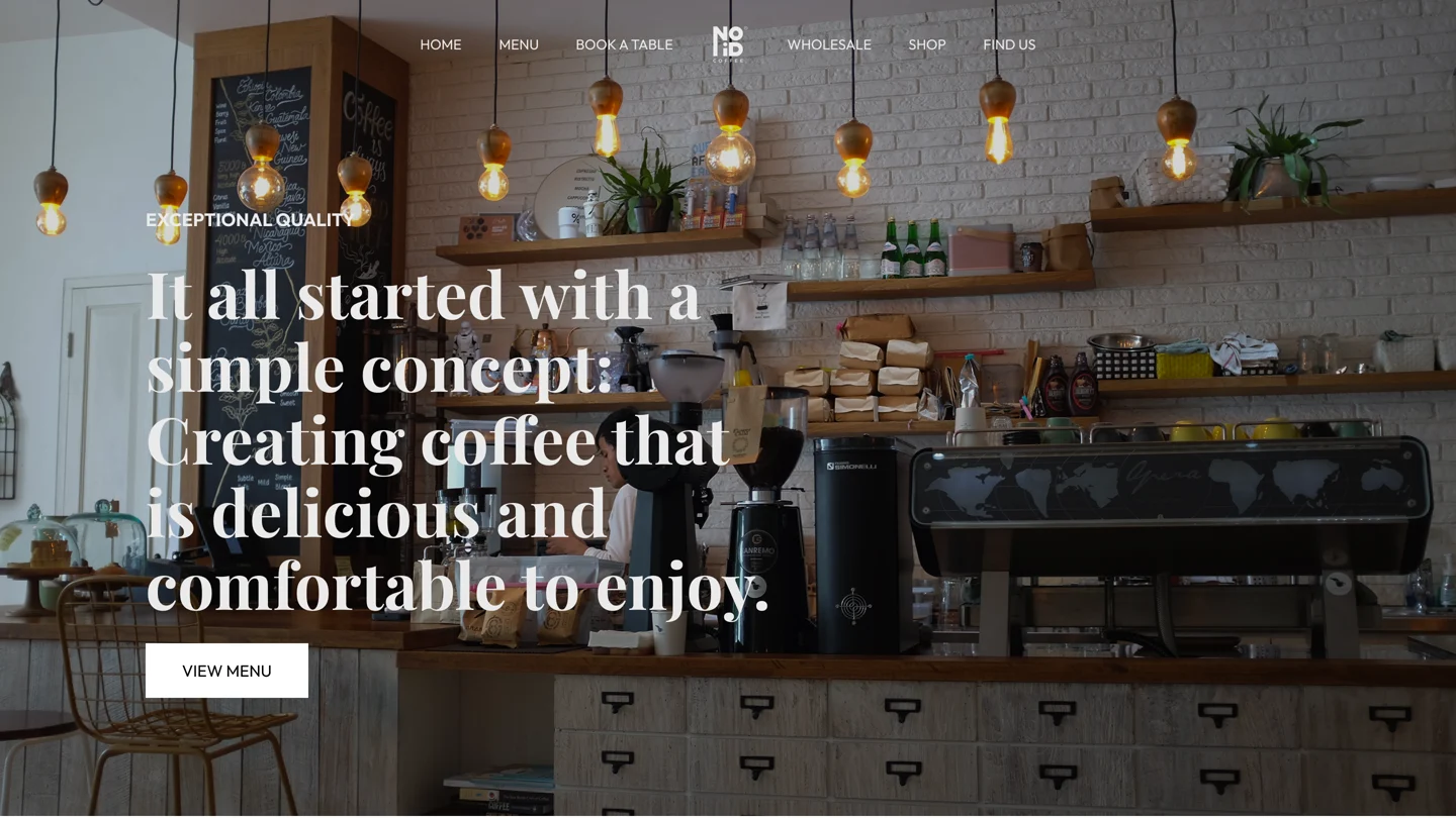
- 01Hero: the bar interior, the founding line and a single View Menu button.
- 02About Us: two short paragraphs on the idea of an anonymous space.
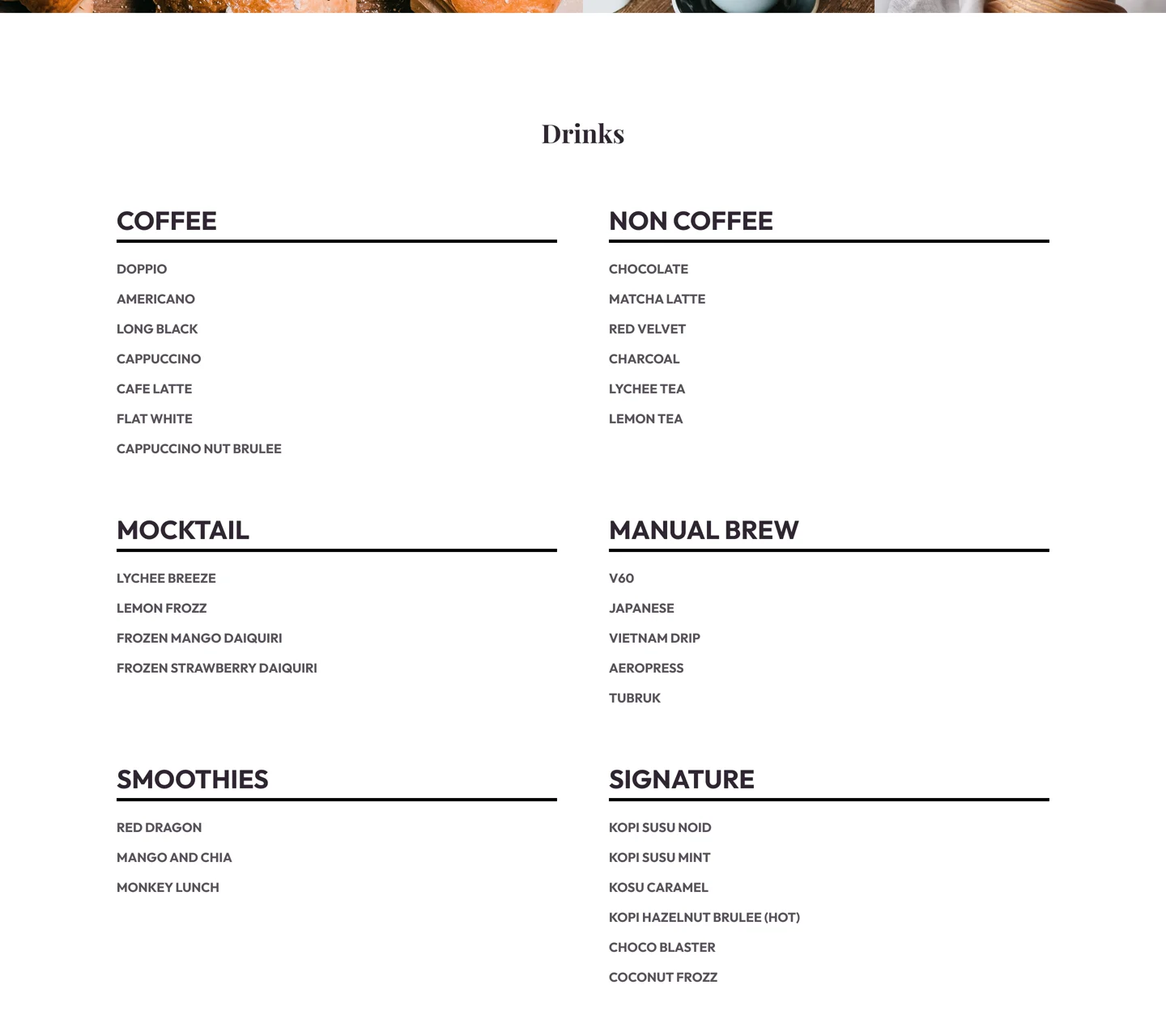
- 03Drinks: six groups, from Coffee and Manual Brew to the house Signature drinks.
- 04Foods: Bites and Signature pastries in the same two-column list.
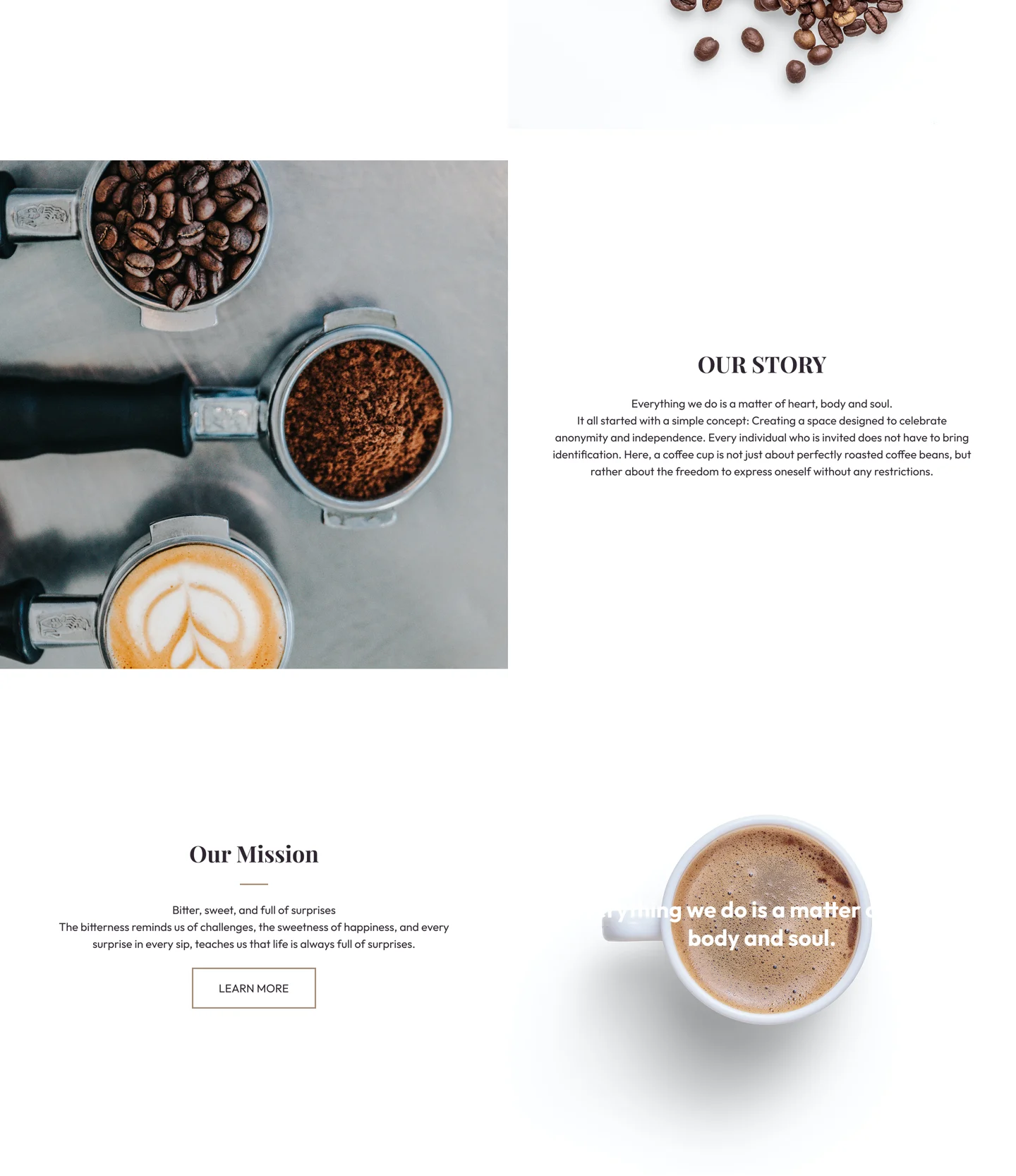
- 05Philosophy, Story and Mission: text and still-life photos alternating left and right.
- 06Footer: a dark navy band with links, socials and the logo.

The shop before the pitch.
The hero shows the real bar under warm pendant lights, with the navigation and logo laid directly over the photo. The headline is the shop's own founding line, set in a large serif, and the only action is View Menu, because that is what most visitors came for.
A menu you can read like a menu.
The menu is laid out the way it would be printed: two columns, bold category names over a thick rule, and small uppercase items underneath. There are no prices, cards or icons competing for attention, so forty items stay easy to scan.
- Drinks are split into Coffee, Non Coffee, Mocktail, Manual Brew, Smoothies and Signature.
- Foods follow the same pattern with Bites and Signature pastries.
- A band of pastry and coffee photos separates the two lists.
Three short reasons to care.
Our Philosophy, Our Story and Our Mission close the page. Each block is only a few lines of centred text beside a still-life photo, and the image switches sides each time so the long scroll keeps a rhythm. A dark navy footer ends the page on the logo.
A coffee shop page does not need features. It needs a mood, a menu and a reason to visit, in that order.
Next, I would design the mobile layout and add opening hours and a map near the top, since most visitors will be looking for the shop on their phone.